Creatures

Abstraction

I run into a lot of people that don't understand the difference between abstraction and caricature.  Maybe that's because the meaning of the words has become muddy in common usage.  Artists in general would be better off if everyone was clear on the terms, though, because while abstraction and caricature are related concepts, they are problems that have to be addressed individually.

My definition of each is:
Caricature=Distortion and exaggeration of a subject's distinctive features
Abstraction=Simplification down to a subject's essential features, eliminating unnecessary information

Abstraction is one expression of a design principle called Signal-to-Noise Ratio, which states that the Signal is any information that is important for the viewer, while Noise is unimportant information which necessarily interferes with the signal

The key in any good design is to identify how much of the detail is actually signal, and downplay/subdue/eliminate everything else.  In other words, not all detail is noise---sometimes it's part of the signal.  The best way to judge whether a detail is signal or noise is:
- Does it say something important about the character?
- Does it enhance the overall style of the piece/property? (ie. Does it say something about the world?)
- Does it significantly increase the character's appeal to my intended audience?
- Will the audience be able to see/appreciate the detail or is it just adding clutter to the scene?
If the answer is no to all four, tone it down or cut it out!

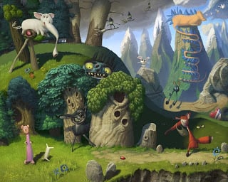
So the level of abstraction in a subject is just an expression of the signal-to-noise ratio.  I usually have to consciously abstract things after my first designs, and I often don't go far enough.  I've seen other artists who have the opposite problem and simplify things so far that they lose their connection to their audience.  I think that's why it's a ratio and not a hard and fast rule; too little is too little, and too much is too much.
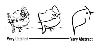
With this Goldcrest, at first glimpse it may seem I didn't abstract things at all, just used caricature to push the personality and distinctive features.  But while I wanted people to react to it as a real bird, the details themselves could become distracting really fast.  So I used tricks like alignment, color, shape juxtaposition, and contrast control to keep the eye focused only on what was important.  Of course, after doing the little abstraction example above I wanted to go back and simplify about 10 more things in this image, so I'm obviously still learning this principle.

Mourning Dove

I always thought they were Morning Doves, but apparently they're more sad.  Maybe they ARE Morning Doves but they're just not morning people.

I keep trying to write a Tip-of-the-Day style post, but it's taking more time than I expected.  Stay tuned.

Resolution

I'll be honest:  I am not likely to finish the book I resolved to write.  At least not anytime soon.  However, after watching Marcelo Vignali's inspiring interview, I decided that I shouldn't wait for that opportune time to share what I'm learning.  So I'm going to revive an old feature of this blog and post the discoveries I make as I evolve as an artist.

I still plan to write a book once I've got some of the gaps filled in my own knowledge, but hopefully this will do until then.

My other resolution is to start working on more personal art, specifically art that I can use to illustrate points in the book.  This image is part of a series of birds I'll use in the character design section of the book.

Thanks everyone for reading and Happy New Year!

Brains

I had this idea of a mad scientist with a malevolent cupcake for a brain and it evolved into this.

Here's another monster with a different brain for a work friend who wanted posters for her Halloween party and an earlier design for the painting.  I like both of these monsters a lot better than the one I used, but the faces/horns were awkward when I tried to pose him with the scientist.  I was heavily influenced by Todd Harris's designs on these guys.

Nemesis

My dreams are strange. Part of my conscious is always aware that it's a dream, and when things get too tense it just takes over---concocting powers and abilities that allow me to deal with the wagon of ninja clowns or whatever the threat happens to be. Because of this I'm never afraid of nightmares.

But last night I had a dream about being hunted by a Tyrannosaurus Rex in a desert canyon. As usual, just when I was cornered with the T-rex bearing down, my brain flipped the switch and I flew out of there like a rocket. But when I looked back, there was the Tyrannosaurus, soaring over rock formations and bursting through cliffs as it flew after me. And no matter what I did I couldn't stop him. My brain kept coming up with new powers, each of which the T-rex countered with a power of its own. I finally woke up, but I'm still puzzling over my new nemesis, the Super-Sith Rex. Will I run into him again? What could it all mean?

Christnas Gift

Our family teamed up for a sort of unique idea for Christmas presents this year: custom puzzles based on our kid's favorite books. My two older boys (ages 6 and 3) drew everything: characters, trees, rocks, mountains, grass. It's unfortunate that I didn't have more time to spend on the painting---a few spare hours spread over a couple weeks wasn't enough to make this picture what it could have been. That being said, I'm still proud of it because it makes a pretty good puzzle. The differences in texture and color are just enough to keep the puzzle challenging but not too frustrating.
In case you're curious, the books referenced here are Horton Hatches an Egg, A Woggle of Witches, The Funny Thing, The Monster and the Tailor, The Runaway Bunny, Gregory the Terrible Eater, Pearl and the Amazing Bone, The Gunnywolf, and What's in Fox's Sack?

Monkey collaboration

My 3-year-old drew this monkey, and described to me the anatomy ("Dose are his kneees, and dose are his feet." "What are those four circles?" "His eaows." "He has four ears?" "Yess.").

So, I just had to make it a reality. I had to take a couple liberties, but for the most part it's pretty true to the source material. I'm also going to paint up a witch my 5-year-old drew, maybe in a couple days.

RANT of the Week: The Power of Shape

Shape is my favorite design principle for good reasons. Two of the most essential laws of design are unification and contrast (and no, I can’t substantiate using the term "laws," but I’m going to anyway, because I’m right, darn it). Unification deals with the visual continuity of a design, and contrast deals with the differentiation of qualities across that design.


First, let's assume that the goal of character design is appeal. And from what I’ve seen, the character designs people find most appealing are 1. Easily read and understood, and yet 2. Have some unique or unpredictable qualities. People like to feel some familiarity with a character, but they expect to see something that feels new. The law of unification can make designs readable, tying even complex designs together in interesting ways. The law of contrast also improves readability by placing emphasis on what’s important and diminishing what isn’t, but also, the right contrasts can generate that sense of uniqueness and unpredictability. Balancing unification and contrast is hard, but they’re important in creating appealing characters.


Fortunately, while balancing the two laws is tough, the principle of shape can be a powerful tool for working unification _and_ contrast into a design. You can unify a design using echoing shapes, complimentary shapes, interlocking shapes, or shapes that share contour lines. You can then add interest to the design using shapes of contrasting size, type, rotation, proportion, and spacing.


These examples are from a side project I volunteered for. I wanted them to draw upon stereotypes—so I didn’t add a lot of unpredictability to the content of the characters. Instead I tried to put interest into their shapes and other elements. With the Igor character, I used like shapes to unify the character and reinforce his heavy, dejected persona. I used a variety of shape sizes, however, to add that little bit of visual interest. I also spaced the shapes unevenly to add some unpredictability. The mad scientist, on the other hand, uses a larger variety of shape types, but they are unified by fitting them within his squarish frame. I also used connecting contour lines to pull the shapes together. The woman uses both like and varied shapes, and contour lines connect them together. I'm not sure the other designs are worth talking about, and that baby is just disturbing.

Well, sorry if that was long. Hope someone finds it helpful. Or even if it sparks discussion, good. Either way, it's always fun writing these.

New avatar


I stuck with the pug merely to keep a tradition. It's not that I have an obsession with pugs---I don't plan to even own a dog, ever. But there is something about their goblin-ey faces that I really like to draw.


Here's the full version.


Ace in Action design diary: Foxy Loxy

Developing the look for Foxy as the main villain was fun. At first we were exploring all sorts of ideas---Foxy as a dark-helmeted evil warrior, or as a fat Jabba-style criminal, and we even played with various alien versions of her. We just wanted to create a great archetypal villain that was the perfect cheesy-sci-fi counterpart of Ace. Along these lines, the story team started pushing this idea of a beautiful-but-dangerous villain with an eyepatch and who had some kind of vague love-interest history with Ace. I thought this idea was perfect, and her design almost flowed automatically from that point onward.


Note again how the final stage of design was to "Chicken Little-ize" the design, making things more simple and streamlined, and pushing the proportions almost too far for comfort. Oh yeah, and we transferred the idea of the original Foxy's braces to become James-Bond-"Jaws" metal teeth.


Once again, the art by others on the project contributed substantially to the final look of Foxy. This was a collaborative process, which I think is what helped us reach such successful designs in the end.