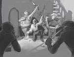
I'm starting to realize that I shouldn't have picked such a complex picture to start with. But like I said, I'm committed, so I'll stick with it and take it as far as I can.
The first question to ask yourself when doing a picture like this is, "Why am I doing it?" In my case, an art forum was having a drawing activity titled, "Pirates vs. Ninjas." Not a good enough reason to spend a lot of time on a picture, especially now that I'm going to spend MORE time on the it. I don't think I can get away from the fundamentally odd idea going on here without destroying the purpose of the "fix bad art" thingy, but I can try to make an image that has enough appeal to make people like looking at it even if they don't really understand it.
The second question is, what am I trying to communicate? At the time I only had a vague idea of something funny with singing pirates and confused ninjas, which is probably why the image is neither that funny, or really, all that clear either. So my new goal is, show why pirates are better than ninjas: musicality.
Now that I've got an answer to important question #2, it's time to figure out how to pull it off. I have a few ideas: 1-Emphasize the pirates, de-emphasize the ninjas. 2-Make the pirates look like they are having fun, and the ninjas are not. 3-Make the pirates look cooler, instead of a bunch of drama pansies (sorry to all drama pansies out there).
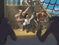
Third "question" (Not a question. More of an "issue."): Appropriate format and composition. This is the biggest problem with my original piece. I created a composition that would look great for a full-color image, but went with a completely wrong format. And since nobody who is not named Eric Canete should tackle a subject this complex in just black and white ink, I think I'll convert the image into a painting.
This has a lot of compositional problems to fix if I'm going to do a painting, but the first is value and lighting scheme (this will affect how I compose and design the characters and background, as you will see later). I did a few thumbnails to test a couple ideas.

Full daylight: pretty good, but the pirates really get lost against the bright background. Making the sky a darker blue might fix that problem, maybe.

Sunset: Very dramatic. But totally wrong for what I want to accomplish.

Night: Better than the other two, might work.
Day with modified background: Also good.
I'm having a hard time deciding between the last two. I even did a quick color pass for each to see if that sorted anything out:

The night scene is very theatrical, but the day scene allows for nice color. Chime in if you think I should go with one over the other.
Next post: Revising the character designs, and how writing sentences without capitalization or punctuation makes you sound like a robot.
The first question to ask yourself when doing a picture like this is, "Why am I doing it?" In my case, an art forum was having a drawing activity titled, "Pirates vs. Ninjas." Not a good enough reason to spend a lot of time on a picture, especially now that I'm going to spend MORE time on the it. I don't think I can get away from the fundamentally odd idea going on here without destroying the purpose of the "fix bad art" thingy, but I can try to make an image that has enough appeal to make people like looking at it even if they don't really understand it.
The second question is, what am I trying to communicate? At the time I only had a vague idea of something funny with singing pirates and confused ninjas, which is probably why the image is neither that funny, or really, all that clear either. So my new goal is, show why pirates are better than ninjas: musicality.
Now that I've got an answer to important question #2, it's time to figure out how to pull it off. I have a few ideas: 1-Emphasize the pirates, de-emphasize the ninjas. 2-Make the pirates look like they are having fun, and the ninjas are not. 3-Make the pirates look cooler, instead of a bunch of drama pansies (sorry to all drama pansies out there).
Third "question" (Not a question. More of an "issue."): Appropriate format and composition. This is the biggest problem with my original piece. I created a composition that would look great for a full-color image, but went with a completely wrong format. And since nobody who is not named Eric Canete should tackle a subject this complex in just black and white ink, I think I'll convert the image into a painting.
This has a lot of compositional problems to fix if I'm going to do a painting, but the first is value and lighting scheme (this will affect how I compose and design the characters and background, as you will see later). I did a few thumbnails to test a couple ideas.
Full daylight: pretty good, but the pirates really get lost against the bright background. Making the sky a darker blue might fix that problem, maybe.
Sunset: Very dramatic. But totally wrong for what I want to accomplish.
Night: Better than the other two, might work.
Day with modified background: Also good.
I'm having a hard time deciding between the last two. I even did a quick color pass for each to see if that sorted anything out:
The night scene is very theatrical, but the day scene allows for nice color. Chime in if you think I should go with one over the other.
Next post: Revising the character designs, and how writing sentences without capitalization or punctuation makes you sound like a robot.